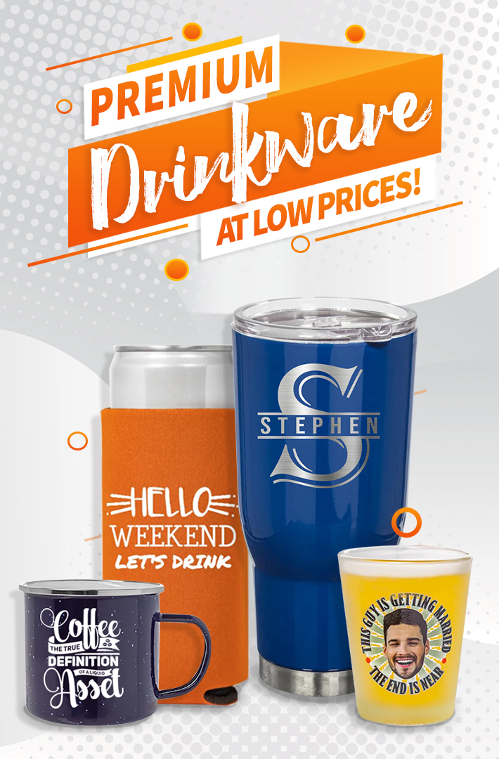
Most printing companies like 24HourWristband or Imprint, produces high quality polos and t-shirts. It has been crafted with care by someone, usually a professional with a background in art and on-the-job experience in prints. Not just in business but also in quality assurance and technical execution skills. You could hire such a printing company to get your polos and t-shirts idea ready to print. Or production services may be available through the publication the ad is going in. Or you could do it yourself IF you have proper equipment, time and manpower to do it. But whether you take on the job or direct someone else, you need to know how you want your shirts to look especially after laundry or in a long-term quality. Here are some basic suggestions to help you figure this out.
The Overview of Your Polos and T-shirts
There are specific techniques for laying out shirts. But before we get specific, we’ll talk about the general processes and techniques that apply to all print ads. Unless you’re very familiar with computer illustration and page layout software, you’ll probably need outside help in creating the actual printers negatively that you send to your publications. People download unlicensed photos from the Internet and then send it to the printing company is a worse action.
This article, it will help you understand the process and the underlying issues of layout and designs. With this background, you can do as much as possible yourself and be clear in the direction you give your professional printing companies (ex. 24HourWristBand) when you need to submit your designs and let them do the printing. You’ll save time and money by being prepared.
Your Layout for Polos and T-shirts
Experience from previous printing companies prescribes fairly rigid guidelines for the layout of polos and shirts. There’s a classic approach that functions beautiful and dominates most polos and t-shirts you see. It’s derived from scientific research into how people look at you, including your employees wearing your shirts representing your brand. Your natural inclination is to look at the upper left, then sweep in an S curve, ending down at the lower right. Or simple from top-left corner, down to bottom-right.
You, as a designer should take advantage of this before you submit your PDF to a printing company. You’ve probably noticed. That most shirts have the logo without TOO MUCH detail in the lower right, where the reader’s eye comes to rest.


